It’s been a while since our last
roundup of Android phones, but we’ve gathered our favorite phones from
all four carriers. All of these devices could be considered high end. At
the rate smartphone technology is evolving, we recommend that you don’t
buy a phone that doesn’t run Android 2.3 (Gingerbread), have a
dual-core processor, and a high-resolution screen this holiday season.
Believe it or not, a number of these high-end devices carry prices as
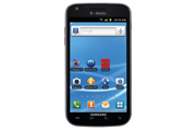
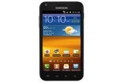
low as $100. Others cost a bit more, but may be worth the investment. Samsung Galaxy S II | Screen: 4.5-inch Super AMOLED, 560×940
Specs: 1.5GHz dual-core, 1GB RAM, 32GB storage
OS: Android 2.3 with Samsung TouchWiz 4.0
Camera: 8MP rear, 2MP front
Price: $200-$230 with two-year contract
Availability: AT&T, Sprint, T-Mobile Description:
The Galaxy S II took its sweet time coming to North America, but it was
worth the wait. The phone has now launched on three of the four major
U.S. carriers. It doesn’t disappoint in any one area, though its plastic
construction may turn off some, though we like how light it is.
Samsung’s TouchWiz 4.0 interface rivals HTC’s Sense as does Samsung’s
cameras. AT&T’s Galaxy S II is a bit smaller than Sprint and
T-Mobile’s at 4.3 inches and each model looks a bit different, but all
three are mostly the same. Read our full review. |
HTC Amaze 4G | Screen: 4.3 inches, 540×960 pixels
Specs: 1.5GHz dual-core processor, 1GB RAM, 16GB storage
OS: Android 2.3 with HTC Sense 3.0
Camera: 8MP rear (LED flash, 1080p rec), 2MP front
Price: $260 with two-year contract
Availability: T-Mobile Description:
We haven’t spent a lot of time with the new Amaze, but from what we’ve
seen, it may be the best overall HTC Android phone on the market. Its
HTC Sense 3.0 interface is among the best looking and most customizable
Android interfaces and HTC isn’t known to skip on build or camera
quality. T-Mobile is claiming the Amaze has the best camera on the
market (aside from the iPhone 4S, this may be correct). Best of all, the
Amaze clocks in as one of the fastest phones on the market. Read our hands-on impressions. |
Motorola Photon 4G | Screen: 4.3 inches, 540×960 pixels
Specs: 1GHz dual-core Tegra 2, 1GB RAM, 16GB storage
OS: Android 2.3 with Motorola NinjaBlur
Camera: 8MP rear, .3MP VGA front
Price: $200 with two-year contract
Availability: Sprint
Description:
As time has wore on, we’ve missed having the Photon in our office. It
suffers from a somewhat bland screen and interface, but everything else
about it is great. The phone has a kickstand so you can prop it up like a
clock, it docks with a ton of Motorola accessories (though they’re
expensive), and is one of the most comfortable 4.3-inch phones we’ve
held due to its button placement and rounded edges. At $200, it’s a
great 4G phone. Read our full review. |
LG T-Mobile G2x | Screen: 4.0-inch LCD, 480×800 pixels
Specs: 1GHz dual-core processor, 512MB RAM, 8GB storage
OS: Android 2.3 (Gingerbread), pure Android
Camera: 8MP rear (LED flash, 720p rec), 1.3MP front
Price: $100 with two-year contract
Availability: T-Mobile Description:
LG doesn’t mess around with Google’s Android interface much and for
$100, the G2x offers specs comparable to the $230 Galaxy S II. The LG
G2x is one of the best phones on the market, but it’s been a sleeper and
hasn’t made waves. It may ship with Android 2.2, but an update is available from LG, which brings the phone up to par with any of these devices. Read our hands-on impressions. |
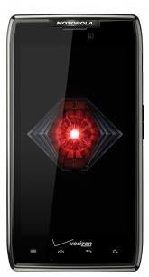
Motorola Droid Bionic
...
Read more »
|
Pros
- Dual-core and Verizon 4G is a speedy combination
- Assortment of entertainment and business features
- HD 1080p video capture
- Lots of compatible accessories
Cons
- Pricey
- Call quality is uneven
- Display disappoints
Bottom Line
The
long-awaited Droid Bionic is blazing fast and has a slew of great
entertainment and business features, but the high price might make it a
hard sell.
It feels as if we’ve waited an eternity (well, about nine months) for the Motorola Droid Bionic ($300 with a two-year contract as of September 7, 2011) to come to Verizon,
but the dual-core 4G phone has finally arrived. While you might cringe
at the steep price, the dual-core TI OMAP processor paired with
Verizon’s superspeedy LTE network makes for one fast phone. But the
Bionic falls short in its display and call quality, making that high
price tag seem a bit unreasonable.
(Editor’s note: We will be lab-testing the Droid Bionic over
the next few days, and we will update this review--and possibly the
score--depending on the results.)
High-Quality Design, Disappointing Display
When you pick up the Bionic, you’ll immediately notice its
high-quality feel and sturdy construction. The dark gray, soft,
rubberized battery cover is nice in the hand, and the Corning Gorilla
Glass face gives it a sophisticated feel. The Bionic’s design isn’t as
fun as that of the Photon 4G
(Sprint), which has a futuristic, angular look. It's somewhat blocky,
and it feels a little large (though admittedly my hands are a bit
small). Measuring 5.00 by 2.63 by 0.43 inches, the Droid Bionic is the
slimmest LTE phone on Verizon. It weighs 5.6 ounces, slightly lighter
than the Photon.
The 4.3-inch qHD (Quarter High Definition) display isn’t as sharp
as we expect a 960-by-540-pixel screen to be. The images I loaded from
my Facebook profile looked a little grainy, with a slight bluish tint. I
could also see a grid of dots in the image--even without zooming in.
Unfortunately, this isn’t the first time we’ve taken issue with a
Motorola phone’s display. The Photon also had a slight bluish tint, and
the Droid 3’s
qHD display suffered from the dots issue. I was impressed, however,
with how sharp the text looked in the browser and in Gmail.
Software: Built for Business and Entertainment
Like the Photon 4G and the other hot phones of the fall, the
Droid Bionic runs the latest version of Android, 2.3.4 (Gingerbread). It
also runs Motorola’s custom-built MotoBlur widgets, including the
social networking widget, which aggregates all of your account profiles
into a single view on your home screen. The widgets are resizable (à la
Android Honeycomb), and you can scroll through them; in the calendar
widget, for example, you can scroll through a whole day’s worth of
events rather than viewing one event at a time.
Unlike other Motorola phones, though, the Bionic is not tied to
the MotoBlur cloud service. Instead, you get an app called ZumoCast,
which lets you access remote files on your PC without having to upload
or sync your files. You can access everything from PowerPoint files to
your iTunes playlists on your Bionic. Even though the Droid Bionic has
plenty of storage (1GB of RAM, 16GB of on-board memory, and a
preinstalled 16GB MicroSD card), I find it nice to be able to access
videos, documents, photos, and other media files without having to
download them to the device or upload them to a cloud service.
Performance
The Droid Bionic takes about 43 seconds to turn on fully. Much of
that time is consumed by a Verizon Droid logo animation, which plays
while the phone is loading. The graphics look neat, but the fact that a
phone this powerful takes so long to boot is kind of surprising. Once
you’re up and running, operating the phone is smooth sailing throughout.
In my tests, flipping through the Bionic’s menus was very fast with no
lag or stuttering. The browser loaded Web pages quickly, over Wi-Fi and
4G. Over Verizon’s LTE network, PCWorld.com loaded in 18 seconds, and
the image-heavy TheBoldItalic.com loaded in an impressive 8.3 seconds.
Over Wi-Fi, PCWorld.com loaded in a speedy 3.3 seconds.
We also tested the phone using Qualcomm's new benchmarking app, Vellamo,
just to see how a TI processor would fare against its competitors. The
Droid Bionic earned a score of 715, which places it below the HTC
Sensation and EVO 3D (both of which are powered by Qualcomm chipsets)
but above the Motorola Atrix 4G (which uses an Nvidia Tegra 2 chip). We
take these scores with a grain of salt since Qualcomm manufactures the
app, but the data is interesting to compare.
Call quality over Verizon’s network was uneven. My friends’
voices sounded hollow and blown out, as if they were talking too close
to the speaker. Sometimes I found it hard to understand them, and I had
to adjust the volume on almost every call. My friends, on the other
hand, were more positive. I made a few of my calls next to a loud
generator, but my friends reported that they could not hear it in the
background.
We’re still conducting our battery-life tests on the Droid
Bionic, so we’ll update with a full report once we’re finished. Battery
life with regard to Verizon’s 4G phones has been a hot issue, so we plan
on investigating the Droid Bionic’s battery as thoroughly as possible.
According to Motorola, the Droid Bionic offers 650 minutes of talk time
and 200 hours of standby time, and takes 3.5 hours to obtain a full
battery charge. It has the largest battery of all Verizon LTE devices,
at 1735 mAh.
Good Camera, Great Gallery
 Like
most of the latest and greatest smartphones, the Droid Bionic has an
8-megapixel camera. It can shoot up to 1080p HD video, too; it's the
first Verizon LTE phone to be able to do so. When I met with Motorola, I
asked the product managers why the Droid Bionic took so long to come to
market. Their response? Among other features, 1080p was added to the
phone after Motorola's initial CES announcement. Like
most of the latest and greatest smartphones, the Droid Bionic has an
8-megapixel camera. It can shoot up to 1080p HD video, too; it's the
first Verizon LTE phone to be able to do so. When I met with Motorola, I
asked the product managers why the Droid Bionic took so long to come to
market. Their response? Among other features, 1080p was added to the
phone after Motorola's initial CES announcement.
 We've
never been blown away by the image quality on Motorola cameras--the
white balance tends to be off, giving photos and video a bluish tint.
The Photon’s camera was slightly better than those of other Motorola
phones, such as the Droid 3 and the Triumph,
so I had rather high expectations for the Bionic’s camera. Thankfully,
it met my expectations: Although the Droid Bionic’s camera isn’t the
best I’ve seen (that honor goes to the T-Mobile MyTouch 4G Slide), I was
pleased with the sharpness, color accuracy, and brightness of my indoor
and outdoor photos. We've
never been blown away by the image quality on Motorola cameras--the
white balance tends to be off, giving photos and video a bluish tint.
The Photon’s camera was slightly better than those of other Motorola
phones, such as the Droid 3 and the Triumph,
so I had rather high expectations for the Bionic’s camera. Thankfully,
it met my expectations: Although the Droid Bionic’s camera isn’t the
best I’ve seen (that honor goes to the T-Mobile MyTouch 4G Slide), I was
pleased with the sharpness, color accuracy, and brightness of my indoor
and outdoor photos.
Video capture was quite good. The Droid Bionic’s camera handled
action without any pixelation or artifacting. Color looked good, and the
microphone did a good job of handling audio.
The enhanced gallery displays photos from your own library, in
online libraries (Facebook, Flickr, Photobucket, and finally Picasa), or
in your friends' libraries on assorted social networks and on DLNA
servers.
Accessories Galore
Like the Photon and the Atrix,
the Droid Bionic can hook up to a special dock that lets you access
your phone in "webtop” mode. When you connect to the webtop dock, you
can access the full Firefox browser as well as a slew of specially made
productivity apps. Certain apps (such as Angry Birds) can run at full
screen on a larger display. The Droid Bionic has all sorts of
accessories available for it, including the Motorola Lapdock ($300, like
the one that was advertised with the Atrix), a standard dock ($40), a
vehicle navigation dock ($40), and an HD station ($100). We’ll be taking
a closer look at the accessories in the next few days, so stay tuned.
Bottom Line
Although we’re still wrapping up our lab tests of the Droid
Bionic, it is safe to say that this is one of Verizon’s strongest phones
available right now. The build quality is excellent, the software is
clean and intuitive, and the addition of ZumoCast is terrific. The
display, however, is a big disappointment. The overall speed of the
Droid Bionic is almost enough to make up for that shortcoming, but the
high price makes the phone a tough sell. On the plus side, if you’re
...
Read more »
|
Pros
- Dual-core processor keeps phone running smoothly
- Excellent battery life over LTE
Cons
- Doesn't run latest version of Android
- Camera is just average
Bottom Line
The Droid Razr Maxx packs in a dual-core processor, large battery and LTE in a very thin frame.
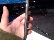
  If the Motorola Droid Razr Maxx
($300 with a two year contract from Verizon; price as of 1/27/12) looks
familiar, that’s because it is virtually identical to the Droid Razr. The big difference between the Razr Maxx and the Razr is battery life: Motorola claims that the Razr Maxx gets 21 hours
of talk time on a charge. One of the weaknesses I found with the
original Razr is that battery life drained rapidly over Verizon’s LTE, a
common problem among the carrier’s fleet of 4G phones. Are Motorola’s
claims true? Does the Droid Maxx’s battery hold up over 4G? While we
didn’t finish talk time testing in time for this review (we will update
once it is complete), the Razr Maxx’s handled video streaming and gaming
over LTE with very little strain on the battery. If the Motorola Droid Razr Maxx
($300 with a two year contract from Verizon; price as of 1/27/12) looks
familiar, that’s because it is virtually identical to the Droid Razr. The big difference between the Razr Maxx and the Razr is battery life: Motorola claims that the Razr Maxx gets 21 hours
of talk time on a charge. One of the weaknesses I found with the
original Razr is that battery life drained rapidly over Verizon’s LTE, a
common problem among the carrier’s fleet of 4G phones. Are Motorola’s
claims true? Does the Droid Maxx’s battery hold up over 4G? While we
didn’t finish talk time testing in time for this review (we will update
once it is complete), the Razr Maxx’s handled video streaming and gaming
over LTE with very little strain on the battery.
(Editor’s Note: The Software, Display and some of the Design
sections of this review were taken from the original Droid Razr review
as the phones are almost identical).
Design
The Droid Razr Maxx is pretty much identical to the Droid Razr in
design however it is slightly thicker and heavier. But really, the
difference isn’t too noticeable. The Razr Maxx weighs 5.11 ounces and
measures 0.35 inches thick while the Razr weighs 4.48 ounces and
measures 0.28-inches thick. The Razr Maxx is still incredibly thin and
is on par in slimness with the Samsung Galaxy Nexus, also on Verizon.
  The
soft-touch back is made out of Kevlar, a material found in high-end
speedboats, bulletproof jackets, and bicycle tires. According to
Motorola, Kevlar is five times stronger than steel. Using Kevlar on a
phone seems a bit, well, weird, but I was surprised with how delicate it
felt and how attractive it looked. The
soft-touch back is made out of Kevlar, a material found in high-end
speedboats, bulletproof jackets, and bicycle tires. According to
Motorola, Kevlar is five times stronger than steel. Using Kevlar on a
phone seems a bit, well, weird, but I was surprised with how delicate it
felt and how attractive it looked.
The solid feel comes from the Droid Razr’s stainless steel core.
It also has splashguard technology, which will protect it if you happen
to get caught in the rain or spill something on your phone.
Super AMOLED Display
We’ve knocked other Motorola smartphones, such as the Photon (Sprint) and the Droid Bionic (Verizon)
in the past for its PenTile displays. The Droid Razr, however, ships
with a 4.3-inch qHD (Quarter High Definition), 960-by-540-pixel Super
AMOLED display. According to Motorola, the Super AMOLED technology
should solve some of the battery issues associated with LTE phones. This
technology has lower current consumption, which helps to conserve
battery life.
The Droid Razr’s display has excellent viewing angles and
visibility outdoors, two trademarks of Super AMOLED technology. Blacks
are very deep and whites are bright, but colors look a bit oversaturated
(another trademark of Super AMOLED display technology.
I did a side-by-side comparison of the Droid Razr against the iPhone 4S.
The iPhone 4S has a slightly higher resolution at 960-by-640, with a
pixel density of 330 pixels per inch (I could not find any pixel density
information for the Razr). While I appreciated the extra screen real
estate on the Razr, the iPhone 4S’s 3.5-inch display looked sharper,
with better color accuracy.
Performance
As I mentioned previously, we haven’t yet lab tested Motorola’s
claims that the Droid Maxx can withstand 21 hours of talk time. I did
some informal tests over 4G, however and was quite impressed with the
Droid Maxx’s battery life. After playing Minecraft for 20 minutes,
battery life decreased only 5%. I also ran the State of the Union
address on YouTube (which runs for 1:05:13) in HQ (high quality) and
battery life only dropped by 20%. I played the game Madden NFL 12 (which
comes preloaded on the Razr Maxx) for 10 minutes and the battery didn’t
drain at all.
Not only did battery life hold strong in these games, but
performance was excellent. The graphics look terrific on the Razr Maxx’s
display and gameplay was smooth without any glitches. Overall, this is
an excellent gaming phone. The Razr’s 1.2GHz dual-core TI OMAP 4430
processor scored a notable 1040 on the Vellamo mobile benchmarking app
for Android (made by Qualcomm).
Call quality was very good over Verizon’s network in San
Francisco. I got coverage almost everywhere I went and never experienced
any dropped calls. My friends and family sounded loud and clear, with
no static or distortion.
Software
The Droid Razr runs Android 2.3.5. It isn’t a pure version of
Android, but it isn’t Motorola’s busy (and often annoying) custom
overlay/service, MotoBlur. It does retain some of the MotoBlur widgets.
The interface is almost identical to that of the Droid Bionic, but with a
few tweaks. The widgets are resizable, and you can scroll through them;
in the calendar widget, for example, you can scroll through a whole
day’s worth of events rather than viewing one event at a time.
Like the Bionic, you get the ZumoCast app/service, though here it
has been renamed MotoCast. MotoCast lets you access remote files on your
PC without having to upload or sync your files. You can access
everything from PowerPoint files to your iTunes playlists on your Razr.
Even though the Razr has plenty of capacity (1GB of RAM, 16GB of
on-board storage, and a preinstalled 16GB MicroSD card), I find it nice
to be able to access videos, documents, photos, and other media files
without having to download them to the device or upload them to a cloud
service.
Motorola is determined to solve the LTE battery life situation.
Smart Actions, a new app, lets you set reminders to notify you when you
should recharge your phone (for example, when you go to bed). If you
forget to plug your phone in, you can set a Smart Action called
"Nighttime Battery Saver,” which adjusts your phone’s network and screen
settings to make your battery last longer the next day.
Smart Actions aren’t just about saving battery life. You can
create different profiles (Work, Home, Workout, and so on) and set rules
for each scenario. If you don’t want your phone to ring out loud when
you’re at work, you can set a rule called Quiet Location so your phone
automatically goes into silent mode during work hours. Overall, Smart
Actions is an easy-to-use, clever app. Although you’ll have to spend a
bit of time setting up the rules for each profile, once that's done,
Smart Actions will make all the adjustments for you.
Camera
The 8-megapixel camera on the Razr Maxx is identical to the
original Droid Razr. And unfortunately, image quality isn’t the best.
All of my photos seemed to have a bit of a dark cast to them--even
photos taken in natural light. Details weren't as sharp as I would have
liked, either. The flash tends to blow out colors and details quite a
bit, so use it only when absolutely needed.
Accessories and Webtop
Like the Droid Bionic and the Photon, the Droid Razr is compatible
with a slew of accessories, such as the LapDock 500 Pro, a laptop-like
portal for the phone. The LapDock 500 Pro has a 14-inch display and a
front-facing camera. When you connect to the Webtop dock, you can access
the full Firefox browser as well as lots of specially made productivity
apps. Other accessories include an HD Station, a vehicle navigation
dock, and a standard dock.
Bottom Line
The Droid Razr Maxx greatly improves upon what was perhaps the
biggest weakness of the Droid Razr: battery life. If you plan on
watching a lot of video or doing some heavy duty gaming on your phone,
the Razr Maxx is a good match for you. If you’re looking to save money,
however, you might opt for the original Razr; it costs $100 less than
the Razr Maxx.
|
 Pros
- Massive and colorful display
- Extremely powerful mobile processor
- NFC chip
Cons
- No MicroSD card included
- Small bezel around the screen
Bottom Line
Like the rest of the Galaxy S II series, the Galaxy S II on T-Mobile is one of the best phones currently available, hands down.
 Considering
the massive screen, the crazy-powerful processor, and the NFC and 4G
support, it’s hard not to fall in love with the Samsung Galaxy S II on
T-Mobile. Available for $220 with a new two-year contract (as of October
10, 2011), the Galaxy S II is a great phone. It has just a few minor
flaws that keep it from being truly amazing. Considering
the massive screen, the crazy-powerful processor, and the NFC and 4G
support, it’s hard not to fall in love with the Samsung Galaxy S II on
T-Mobile. Available for $220 with a new two-year contract (as of October
10, 2011), the Galaxy S II is a great phone. It has just a few minor
flaws that keep it from being truly amazing.
A Tablet-Size Phone
The Galaxy S II boasts the same gigantic, 4.52-inch (480-by-800-pixel resolution) screen we saw on the Epic Touch 4G
for Sprint--and that impressive screen is definitely the phone's
biggest draw. Colors on the Super AMOLED Plus display appear bright and
vibrant, if a little oversaturated. The phone is extremely lightweight,
thanks largely in part to its plastic casing. I was never really a fan
of the plasticky body of the original Galaxy S, but the Galaxy S II feels solid enough that I can overlook it here.
At 5.11 by 2.71 by 0.37 inches, the T-Mobile Galaxy
S II is slightly taller and thicker than the version made for AT&T.
When comparing the two phones side by side, I found that I preferred
the AT&T Galaxy S II
over the T-Mobile one simply because it was much more comfortable to
hold. Although larger screens are great for activities such as watching
movies or browsing the Web, I thought that the screen size of the
T-Mobile Galaxy S II seemed like a bit of overkill on Samsung’s part.
The biggest problem I have with the T-Mobile Galaxy
S II is how narrow the bezel is at the sides of the screen. When I
navigated the large screen, the bottom part of my hand would constantly
hit one of the capacitive buttons under the screen, or brush against the
bottom quarter of the touchscreen. Whenever I went to check a
notification or enter a URL in the browser, I also ended up opening a
menu or launching the dialer. In one instance, I was in the middle of
composing a text message, and I wound up closing out of it several times
before I could send it.
Specs and Performance
With a 1.5GHz dual-core Qualcomm Snapdragon processor, the
T-Mobile Galaxy S II is the most powerful one of the bunch. Everything
from basic phone functions to intense 3D games run as smooth as silk.
The only time the phone ever slowed down or got stuck was when I tried
unlocking it: The lock screen hung for about 3 seconds before
responding. To be fair, at the time I was downloading and installing 15
apps at once, so that could explain the minor hiccup I experienced. The
phone comes with a Task Manager; since the handset has 1GB of RAM,
however, you shouldn’t ever need to use it.
To--ahem--better test how well the Galaxy S II handled games, I downloaded and played Minecraft: Pocket Edition
on the device. The game ran well and looked great on that massive
display--the Galaxy S II makes for an above-average mobile gaming
device. After a good hour of play, I noticed the phone getting really
warm, but it wasn't hot enough to be uncomfortable to hold. I also
noticed that my hour of gameplay had little effect on the battery--I
probably could have squeezed another 2 to 3 hours of Minecraft in if I
were so inclined. After about 4 hours of heavy use over 4G, I managed to
drain the phone’s battery completely. Samsung has rated the phone as
lasting 167 hours on standby, but we’ll have to wait for the PCWorld
Labs to test the phone officially to see if that claim holds up.
Call quality on the T-Mobile Galaxy S II was nice
and even in San Francisco, but the people I called said that I sounded
slightly distorted. The occasional hiss and warping cropped up on my
end, but it was hardly noticeable. Overall I can say that making calls
using the Galaxy S II was an excellent experience.
Using the Speed Test app as an informal network
test, I managed to get 3 megabits per second down and 0.44 mbps up in
San Francisco. We don’t have the best T-Mobile 4G coverage here, but
those speeds are typical of what we have seen with past 4G T-Mobile
devices.
Software and Extras
The Samsung Galaxy S II runs Android 2.3.5 (Gingerbread) and
has a few preloaded apps. Netflix comes preinstalled, and runs extremely
well over 4G. I could have done without the Blio and Zinio apps, but I
can see their usefulness for people who like to read while on the go.
Being a Samsung phone, the Galaxy S II also sports
the latest version of TouchWiz. Personally, I prefer vanilla Android or
the HTC Sense overlay, but TouchWiz has a few things that I really
enjoy. Aside from the bright and colorful icon set, this iteration of
TouchWiz employs motion controls for basic actions. To zoom in on a Web
page, for instance, you simply place both thumbs on the screen and tilt
the phone forward or backward. I found this motion far more intuitive
than pinch-to-zoom, and far more accurate.
In addition, I was pleasantly surprised to find out
that the T-Mobile Galaxy S II comes with a Near Field Communication
chip. With such a chip, the Galaxy S II can read NFC-compatible tags. We
haven’t seen many phones that support NFC, and it’s a neat technology
that I wish more phone manufacturers would include in their devices.
Multimedia
Considering the phone's giant screen, you’ll likely want to
watch movies on this handset. Although I’m not normally a fan of using a
phone as a media player, I can see the appeal of doing so with a
display of this size. If you are adamantly against watching videos on
your phone, you can easily share them with your DLNA-enabled devices
using AllShare.
  The
phone has 12GB of internal storage, but unfortunately it doesn’t come
with a MicroSD card. The Galaxy S II is a stellar music player, though,
and could easily replace your stand-alone MP3 player. Should you decide
to make the Galaxy S II your primary audio device, the phone comes with a
pair of (mediocre) headphones that you can use. The
phone has 12GB of internal storage, but unfortunately it doesn’t come
with a MicroSD card. The Galaxy S II is a stellar music player, though,
and could easily replace your stand-alone MP3 player. Should you decide
to make the Galaxy S II your primary audio device, the phone comes with a
pair of (mediocre) headphones that you can use.
Photos that I took with the phone's 8-megapixel
camera turned out sharp and clear. Colors seemed a little off, but still
looked good overall. The 2-megapixel front-facing camera also did a
good job of capturing still images, though it works better for video
chat. The Galaxy S II records video at 1080p, and holds its own as a
video camera; it picks up voices nicely, but the footage suffers from a
jelly effect when you move the phone around.
Bottom Line
The Samsung Galaxy S II is the best phone you can buy right
now on T-Mobile. This is a top-of-the-line phone, and it's perfect for
people who love larger screens. Though some people may find the handset a
little too big, the inclusion of 4G and NFC means that this device
won't feel dated down the line. If you crave true power from your
smartphone, and if you want the best that your carrier has to offer, the
Galaxy S II is the phone to get.
|
Pros
- Outstanding camera
- Latest software and chipset technology
- Wide range of shooting modes and editing tools
Cons
- Keyboard is difficult to type on
- No HDMI port
Bottom Line
The MyTouch 4G Slide has one of the best cameras we've ever tested--and the rest of the phone is pretty amazing as well.
Earlier this month, T-Mobile announced the latest addition to its MyTouch family, the myTouch 4G Slide
($200 with a two-year contract, as of July 15, 2011). The specs look
pretty standard for this summer's slew of high-end smartphones: 4G
connectivity, a 3.7-inch Super LCD screen, Android 2.3 and a dual-core
processor. All of this is great and everything, but what really caught
my eye were the camera's specs. In fact, T-Mobile claims that the Slide
has the most advanced camera of any smartphone available. So how does
the Slide hold up as both a phone and a camera? Read on to find out.
Slider Design
As the name implies, the HTC-built MyTouch 4G Slide has a
slide-out full QWERTY keyboard in addition to a 3.7-inch WVGA super LCD
touchscreen. For a slider phone, I was surprised with how thin the Slide
is at only 0.54 inches thick. For comparison, the keyboard-less myTouch 4G is 0.43 inches thick. It weighs a manageable 6.5 ounces.
The keyboard's keys are nicely spaced and large enough, but
unfortunately they are a bit too flat for my liking. I found myself
using Swype on the touch keyboard more than the physical keyboard.
Killer Camera
  The
Slide has an 8-megapixel camera and an HD camcorder that can shoot
video in up to 1080p. It also has an array of advanced features. As
phones beat editor, my camera knowledge is pretty basic, so I went to
our cameras beat editor, Tim Moynihan, to decipher some of these specs
and features for me. The
Slide has an 8-megapixel camera and an HD camcorder that can shoot
video in up to 1080p. It also has an array of advanced features. As
phones beat editor, my camera knowledge is pretty basic, so I went to
our cameras beat editor, Tim Moynihan, to decipher some of these specs
and features for me.
The Slide supposedly has zero shutter lag, which sounds good on
paper, but it is something we definitely needed to put to the test.
According to Tim, the autofocus system has to be pretty fast in order to
capture non-blurry images without any delay. Looks like T-Mobile's
claims are true; the Slide's camera was perfectly snappy and smoothly
handled every subject we threw at it.
The camera has a backside illuminated sensor, which is fairly
standard in the most recent crop of point and shoot cameras these days,
which works well for low-light situations without need for a flash. The
Slide's F2.2 lens is a wider aperture than many recent cameras, which
also translates to better low-light shooting without the flash.
  SweepShot exampleThe
SweepShot mode is similar to Sony's Sweep Panorama mode, which is very
cool. You press the shutter and move the camera from right-to-left, and
the camera stitches together a panoramic image instantly. This mode is
incredibly fun to play with and the photos look pretty good (see
example) though sometimes they don't stitch up accurately. SweepShot exampleThe
SweepShot mode is similar to Sony's Sweep Panorama mode, which is very
cool. You press the shutter and move the camera from right-to-left, and
the camera stitches together a panoramic image instantly. This mode is
incredibly fun to play with and the photos look pretty good (see
example) though sometimes they don't stitch up accurately.
  HDR exampleThe
ClearShot HDR mode is a lot like the iPhone's HDR feature. It snaps a
group of photos in rapid succession at different exposure levels, then
"stacks" them in the camera to bring out highlights in shadowy areas and
create an HDR shot. In my opinion, HDR can either look really cool or
really bizarre and blurry. It is fun to play around with, though (take a
look at the example). HDR exampleThe
ClearShot HDR mode is a lot like the iPhone's HDR feature. It snaps a
group of photos in rapid succession at different exposure levels, then
"stacks" them in the camera to bring out highlights in shadowy areas and
create an HDR shot. In my opinion, HDR can either look really cool or
really bizarre and blurry. It is fun to play around with, though (take a
look at the example).
BurstShot is a really unique feature for a phone camera. This
mode takes pictures in rapid succession as you hold the shutter button
down (paparazzi style). BurstShot is useful for snapping photos of
quick-moving objects, like kids and pets.
  Macro exampleMacro
mode lets you take close-up shots of objects like the Furby, pictured
here. You can get as close as about three inches to your object before
the camera starts to lose focus. Tim says that this is pretty good, but
there are point-and-shoot cameras that can shoot even closer. Macro exampleMacro
mode lets you take close-up shots of objects like the Furby, pictured
here. You can get as close as about three inches to your object before
the camera starts to lose focus. Tim says that this is pretty good, but
there are point-and-shoot cameras that can shoot even closer.
Image quality is excellent for a phone camera. A lot of camera
phones have a difficult time handling colors. Tim said that the Slide is
on a par with $200-to-$300 stand-alone point-and-shoot cameras.
According to Tim, the camera's interface is the best touch interface
he's seen on a camera. It is easy to navigate, responsive, and provides
helpful information for shooting in various environments.
Video quality was very good as well. In my casual tests, the
Slide handled quick-moving objects without any distortion or pixelation.
We'll have full camera and video test results posted next week.
Sense and MyTouch Come Together
The user interface is sort of a mash-up between the latest
version of HTC Sense and the custom-built UI we saw on the T-Mobile
MyTouch 4G. According to T-Mobile, the MyTouch rocks the same version of
Sense (Sense 3.0) as the HTC Sensation (also on HTC). The latest
version of Android, Gingerbread, is running underneath Sense.
You get a new customizable lock screen, which works similarly to the newly announced lock screen in iOS 5.
You can pick a theme for your lock screen (the phone offers quite a few
of them to choose from) and then select four apps that you visit most
frequently. When you turn on your phone, you'll see the four apps at the
bottom of the screen. To unlock the screen, simply drag the circle into
position over an app, at which point you'll jump straight to that app.
Thanks to this feature, you don't have to go through multiple menus to
reach your e-mail or other frequently accessed items.
The new version of Sense has a spruced-up Walls system, too.
Rather than having to flick back and forth between your walls, as you do
in the stock Android operating system, you can flick the Slide's screen
to make the walls spin. The effect is reminiscent of a rotating
carousel. And like the older version of Sense, you can pinch anywhere in
your homescreen to see thumbnail-size images of your walls.
The MyTouch 4G Slide comes with a few preloaded apps including
T-Mobile Video Chat powered by Qik for the front-facing camera and Group
Text by Bobsled, which lets you send and receive text messages with
groups of friends.
Performance
Call quality over T-Mobile's network in San Francisco was
reliably good and I did not experience any dropped calls. My friends on
the other end of the line reported my voice sounded a bit distant, but
clear with no distortion.
T-Mobile's HSPA+ network is weak where our office is located so I
tested the Slide in a number of different locations around the city.
The Slide's dual-core Qualcomm Snapdragon processor (the same
you'll find in the HTC Sensation and the HTC EVO 3D) easily handled all
the apps and media-heavy sites we threw at it. We also tested the phone
using Qualcomm's new benchmarking app, Vellamo. The Slide scored an 803,
placing it right behind the HTC Sensation, also on T-Mobile.
Bottom Line
When I hear about phones with a single headlining feature, like
say a really powe
...
Read more »
|
Pros
- 720p display
- Incredibly fast dual-core processor
- Beats Audio built-in
Cons
- Preloaded with bloatware
- Terrible battery life
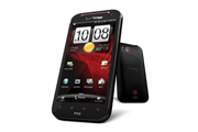
 The
HTC Rezound ($300 with a new two-year contract as of January 3, 2012)
is one of the more capable devices released in the past year. With beefy
specs, including a 1.5GHz dual-core Snapdragon processor and Verizon LTE 4G connectivity, the Rezound holds its own against other Verizon smartphones. The
HTC Rezound ($300 with a new two-year contract as of January 3, 2012)
is one of the more capable devices released in the past year. With beefy
specs, including a 1.5GHz dual-core Snapdragon processor and Verizon LTE 4G connectivity, the Rezound holds its own against other Verizon smartphones.
Design
With a 4.3-inch, 1280-by-720-resolution super LCD screen, the Rezound
is definitely on the larger side. Although the phone may not fit in
everyone’s pocket, the roomy display is great for watching movies and
playing games. At 6 ounces, the Rezound can feel a bit hefty, but that
weight also makes the phone feel rock solid.
Like most other HTC phones, the Rezound has a straightforward
design. On the front of the device are the four standard Android
navigation buttons (Home, Menu, Back, and Search), as well as a
2-megapixel front-facing camera. The back of the Rezound sports an
8-megapixel camera with dual-LED flash, and it has a soft rubber surface
that feels nice in the hand. The volume rocker and power button sit
flush with the rest of the phone, giving it a very streamlined look, but
also making them somewhat difficult to press. Buttons aside, the
Rezound is still very well designed.
Specs and Performance
When it comes to specs, the Rezound is a beast. The dual-core 1.5GHz
Snapdragon processor keeps the phone feeling zippy and is great for
running graphics-intensive games such as Grand Theft Auto 3 and Dead Space.
Unfortunately all that power comes with a price: The Rezound’s battery
life is less than optimal. After I spent 3 hours playing games, browsing
the Web, and downloading apps over LTE, our fully charged test Rezound
had only 30 percent of the battery remaining. The Rezound has several
different modes to help regulate power consumption; if you are a heavy
apps user, however, you will want to invest in an extended battery pack.
We will update this section once we put the Rezound through our
official battery tests.
The high-resolution display looks great, but it sometimes lagged
when I pressed a button or swiped between home screens. This usually
occurred after I exited an app, but it didn’t happen enough to be a
nuisance.
The Rezound takes advantage of Verizon’s blazing LTE network. Here
in San Francisco, I was able to download several hundred megabytes'
worth of data in only a few short minutes over a strong connection.
Using the FCC-approved Ookla Speed Test app, I clocked download speeds
of around 11.55 megabits per second, and upload speeds of about 10.38
mbps. Call quality was even, with no hiss or static. The people I called
said that I came through clearly, and that they couldn’t hear any
background noises in my call.
Software
The Rezound runs HTC Sense over Android 2.3 (Gingerbread) and comes
with a handful of preloaded software. The Amazon Kindle app, Blockbuster
Mobile, Polaris Office, and Slacker Radio all come preinstalled, along
with the full version of Need for Speed Hot Pursuit and a demo of Let’s
Golf 2. While some of these apps may be useful and entertaining, it’s a
shame that you have no option to uninstall any of them should you not
want them cluttering your phone.
The HTC Sense overlay runs well on the Rezound, and brings along a
few features that are missing from stock Gingerbread. The lock screen
allows you to launch applications quickly without having to unlock your
phone first, and the notification bar contains a list of recently opened
applications for easier multitasking. The Rezound is slated to receive Android 4.0 (Ice Cream Sandwich) sometime later this year; it will be interesting to see how Sense interacts with the new OS.
Entertainment
If you like to use your smartphone as a media player, you will be interested to learn that the Rezound has built-in Beats Audio
for better listening. When you plug in Beats Audio-compatible
headphones, the Beats Audio software will enable itself and will
supposedly "enhance” the audio.
In my tests, I concluded that the Beats Audio software does make
music sound better when enabled--but only because normal playback sounds
muffled and murky. You’ll want to keep the Beats Audio software enabled
whenever you listen to music on the Rezound. If you don’t happen to
have Beats-compatible headphones already, try the pair that HTC has
graciously included along with the phone. Although they aren't the best
headphones ever, they do a better job than most headphones you find
prepackaged with phones these days.
The HD episode of Doctor Who that I watched on the
Rezound looked excellent, and streaming video over LTE worked
flawlessly. As I mentioned earlier, the Rezound’s robust processor makes
it awesome for games, and a few hours of playing Dead Space on the
Rezound certainly made my daily commute enjoyable.
Camera
  Outdoor test shot using the RezoundThe
8-megapixel camera on the Rezound is decent enough for everyday photos,
but performs poorly in dimly lit environments. In areas with good
lighting, colors can look washed out, and objects can sometimes have a
reddish tint. The front-facing camera offers good image quality, but you
most likely won’t use it for anything besides a few self-portraits. Outdoor test shot using the RezoundThe
8-megapixel camera on the Rezound is decent enough for everyday photos,
but performs poorly in dimly lit environments. In areas with good
lighting, colors can look washed out, and objects can sometimes have a
reddish tint. The front-facing camera offers good image quality, but you
most likely won’t use it for anything besides a few self-portraits.
The Rezound is capable of recording in 1080p, and it did well at
picking up audio. It produced a mild jelly-like effect when recording in
1080p, but the result wasn't the worst that I’ve seen. Something that I
must commend HTC on is the amount of options available in the camera
software: You can fine-tune various aspects for better photos, including
sharpness, saturation, and exposure, and the Rezound even features a
panorama mode that makes it extremely easy to capture panoramic images.
Bottom Line
The HTC Rezound is one of the best phones available in terms of
specs, and it's perfect for media junkies who like to use their
smartphone as a multimedia player. The high-resolution display is well
suited for movies, and the included Beats Audio headphones are a
much-appreciated bonus. The battery life is weak, however, so you will
want to buy an extended battery or carry a charger around just in case.
Now for the hard part: choosing between the Rezound and the Samsung Galaxy Nexus.
Both are excellent devices, but the decision comes down to what you are
looking for in a phone. If you want a phone that is always up-to-date
with the latest software, go with the Galaxy Nexus. If you value specs
more and can wait a few months for Ice Cream Sandwich, the Rezound will
suit you just fine.
|
Pros
- Fast dual-core speeds
- Ultimate entertainment phone
- Gorgeous design
Cons
- 3D cool, but gimmicky
- Call quality uneven
Bottom Line
Uneven call quality doesn't stop the Evo 3D from being the best phone currently available on Sprint.
I'm not sold on 3D for consumer devices,
and I'm certainly skeptical of it on a smartphone-size screen. However,
Sprint and HTC make a great team, so I decided to keep an open mind
about the HTC Evo 3D.
Did the Evo 3D change my opinion of 3D phones? Well, let's just say it
is a very good thing that there's more to this phone than just a 3D
display.
Solid, Beautiful Design
 First
and foremost, the Evo 3D is a gorgeous phone. Like the Evo 4G, the Evo
3D is black with blood-red detailing. Keeping it in the family, the Evo View Android tablet,
also announced today, has the same color scheme. The Evo 3D smartphone
feels solid, but not bulky in the least. It has a nice, textured rubber
backing and a slimmer shape that feels good in hand. First
and foremost, the Evo 3D is a gorgeous phone. Like the Evo 4G, the Evo
3D is black with blood-red detailing. Keeping it in the family, the Evo View Android tablet,
also announced today, has the same color scheme. The Evo 3D smartphone
feels solid, but not bulky in the least. It has a nice, textured rubber
backing and a slimmer shape that feels good in hand.
With the battery in place, the HTC Evo 3D weighs 6 ounces. It
measures about 5 inches tall, nearly 3 inches wide, and 0.47 inches
thick. Its display is a 4.3-inch 3D touchscreen with a sheet of Gorilla
Glass for added toughness. Unlike the Evo 4G, the Evo 3D doesn't sport a
kickstand--mainly because the twin 3D cameras occupy most of the space
on the rear.
3D Display
One of the most important features of the Evo 3D is, of course, its 3D display.
The phone uses parallax barriers to display 3D images and video,
without the need for clunky 3D glasses (similar to the concept used on
the Nintendo 3DS). The Evo 3D's 4.3-inch qHD 960-by-540-pixel screen
looks terrific in 2D--and pretty good in 3D, as well. Let me be clear,
however: This isn't the kind of 3D you'd see at the movie theater.
Images aren't exactly flying in your face. Rather, it looks like you can
peer into the phone much like a diorama.
You need to maintain an absolute dead-on viewing angle to
properly appreciate the third dimension, though. If you're viewing at a
slight angle, the image will look like a blurry mess. This can be
difficult with a small screen. With an image or a short video clip, it
isn't too hard to hold the phone directly in front of your eyes for a
few seconds. And don't even think about trying to watch 3D movies
outside; it completely fades in bright sunlight. If you don't want to
view 3D images and prefer to stick to the standard 2D display, a toggle
switch on the side of the device allows you to turn the effect off.
New HTC Sense User Interface
Like the HTC Sensation, the Evo 3D comes with the latest version of the Sense user interface.
Sense 3.0 has a brand-new customizable lock screen. You can pick a
theme for your lock screen (the phone offers quite a few to choose from)
and then select four apps that you visit the most. When you turn on
your phone, you'll see those four apps at the bottom of the screen. To
unlock your phone, you drag the circle and move it over an app; you then
jump straight to that app. That way, you don't have to go through
multiple menus to reach your e-mail or any other items you access
frequently.
The new version of Sense also has a spruced-up Walls system.
Rather than having to flick back and forth between your walls, as you do
in the stock Android operating system, you can flick the Evo 3D's
screen to make the walls spin. The effect is slightly reminiscent of a
carousel and makes navigation a little easier.
You'll find a clutch of new widgets in Sense, but my favorite is
the gorgeous new Weather widget. HTC has a nice tradition of creating
visual weather apps, and it is cool to see the company continue to
improve them. They might not always be pretty, but they sure are
dramatic.
Performance
The Evo 3D is powered by a 1.2GHz dual-core Qualcomm Snapdragon processor.
The Snapdragon processor supports advanced 3D technology, including
full 1080p 30-frames-per-second HD video and stereoscopic 3D video
capture and playback.
So how much of a difference does dual-core make? We matched the
Evo 3D up against its predecessor, the HTC Evo 4G (a single-core
device), and there's quite a big difference--one you'll notice as soon
as you turn on the phone. The Evo 4G had a startup time of 74 seconds
(!), while the Evo 3D had a much faster startup time of 13.7
seconds. File transfer speed was about the same for both phones, with
the Evo 4G clocking in at 7.8 megabits per second versus the Evo 3D with
7.2 megabits per second.
We also conducted two gaming performance tests using GLBenchmark,
a software suite that tests the quality and performance of OpenGL
graphics. We conducted two tests: one with antialiasing on, and one with
it off. (Antialiasing is a graphics setting present in many games and
is intended to make gameplay graphics look smoother--for a full
explanation of the pros and cons of antialiasing, check out Geek 101: Making Sense of Anti-Aliasing).
We measured the graphics in frames per second (fps)--the more frames
per second, the smoother the animations and graphics. The difference
between the single-core Evo 4G and the dual-core Evo 3D is huge: With
antialiasing off, the Evo 4G averaged 5.7 fps while the Evo 3D averaged
36.5 fps.
We're currently testing other dual-core phones, including the HTC
Sensation and the LG T-Mobile G2x, to see how the Evo 3D's Snapdragon
chipset stacks up against its Tegra 2 competitors.
3D Camera and Video Capture
Despite my mixed feelings about 3D, there's something quite
satisfying about capturing 3D images or videos and then being able to
watch them on the same device. But you can also view them on any 3D TV
with the help of the phone's HDMI-out jack. The HDMI jack uses a technology called MHL (Mobile High-Definition Link) that allows both charging and HDMI-out via the same port.
Like the Sensation 4G, the Evo 3D comes loaded with Watch, HTC's
new movie and TV-show streaming service. With Watch, you can download
videos and start viewing them immediately. Watch is well integrated into
Sense, making it easier to find the videos you want to, um, watch. The
app's interface is clean, and movies are easy to find, but the library
is pretty sparse at this point. You'll find some newly released movies
like Due Date and some classics like Top Gun. If you're looking for something in particular, though, you're not likely to find it (no Spinal Tap!). A few popular TV shows like Chuck and Gossip Girl are available, but you're limited to one or two seasons of episodes.
Data Speeds and Call Quality
The Evo is also juiced with Sprint's 4G data speeds,
and it comes with a 4G mobile hotspot feature that lets you share your
connection with up to eight devices. I tested the Evo 3D's data speeds
using the FCC Speedtest app in the South Park area of San Francisco. The
Evo 3D achieved average download speeds of 3.59 megabits per second and
average upload speeds of 1.42 mbps. This is in line with other 4G
Sprint phones we have tested in the past. And thank goodness for the 4G
widget on Sprint phones, which makes it easy to switch 4G on and off
(this setting is buried in the Settings menu on Verizon's 4G phones).
Call quality over Sprint's network in San Francisco was okay, though it could be uneven at times.
Bottom Line
The Evo 3D is a powerful phone--3D or not. My opinion of 3D
remains pretty much the same: It is fun to watch short videos in 3D or
take 3D photos, but it is definitely still a novelty feature. That said,
the Evo 3D's design is gorgeous, and the combination of dual-core
Snapdragon processors with 4G can't be beat. It is definitely the best
phone on Sprint, and a worthy successor to the original Evo
Views:
1312
|
Added by:
Adamsummer
|
Date:
2012-04-03
|
|
Pros
- Bright, clear Super AMOLED Plus display
- Superb performance
- Excellent camera
Cons
- Lots of bloatware/preloaded apps
- Plasticky build
Bottom Line
The slim and
speedy Samsung Epic Touch 4G is excellent for gaming, Web browsing and
watching video, but the plasticky design feels a bit on the cheap side.
Samsung Epic Touch 4G for Sprint: Slim and Speedy
 The arrival of Samsung's Galaxy S II
phones has been a long time coming. We first saw the next generation of
Samsung's popular line of Android phones back in February at Mobile
World Congress. After many successful months in Europe, the Galaxy S II
line of phones is finally coming to U.S. shores. The first of the
phones, the Samsung Epic Touch 4G ($200 with a two-year contract with Sprint; price as of September 12, 2011) will be available starting on September 16. The arrival of Samsung's Galaxy S II
phones has been a long time coming. We first saw the next generation of
Samsung's popular line of Android phones back in February at Mobile
World Congress. After many successful months in Europe, the Galaxy S II
line of phones is finally coming to U.S. shores. The first of the
phones, the Samsung Epic Touch 4G ($200 with a two-year contract with Sprint; price as of September 12, 2011) will be available starting on September 16.
Ridiculously Thin
 The
Epic Touch might be a bit larger than the previous generation of
phones, but it is incredibly thin. Measuring 5.1 inches by 2.7 inches by
0.38 inch, the Touch feels pretty comfortable in hand--and this is
coming from somebody with small hands! Samsung phones have a bit of a
reputation for being plasticky, and the Epic Touch unfortunately falls
under that descriptor. In her hands on
of the Epic Touch at Samsung's launch even, my colleague Melanie Pinola
remarked that it felt "less refined" than AT&T's Galaxy S II
version. The
Epic Touch might be a bit larger than the previous generation of
phones, but it is incredibly thin. Measuring 5.1 inches by 2.7 inches by
0.38 inch, the Touch feels pretty comfortable in hand--and this is
coming from somebody with small hands! Samsung phones have a bit of a
reputation for being plasticky, and the Epic Touch unfortunately falls
under that descriptor. In her hands on
of the Epic Touch at Samsung's launch even, my colleague Melanie Pinola
remarked that it felt "less refined" than AT&T's Galaxy S II
version.
On the bottom of the phone, you'll find the MHL
port, a feature we've seen on many of this year's high-end smartphones.
The MHL specification, which stands for Mobile High Definition Link, is a
1080p HD video and digital audio interface for connecting smartphones
and other portable devices (tablets, cameras, and the like) to HDTVs. So
what's the big deal? It simultaneously provides power to your
phone--something that HDMI cables don't do.
Super AMOLED Plus Display
The 4.52-inch Super AMOLED Plus display on the Epic
Touch is quite nice, but text isn't quite as sharp as what we saw on
the European Galaxy S II. The Epic Touch's display is slightly larger
than the European version (which has a 4.3-inch display) so it seems
like the text sharpness may have been compromised by larger screen real
estate. The text is still quite readable, but it is something I noticed
right away upon using the phone.
Otherwise, the display's colors looked bright,
details were crisp, and the viewing angles were very good. Blacks were
deep, and colors were richly saturated without being overdone. Even when
held in direct sunlight, the Epic Touch's display remained incredibly
visible. Whites had a bit of a bluish tint, but it wasn't too
noticeable. According to Samsung, Super AMOLED Plus displays have 50
percent more subpixels than the first-generation Super AMOLED displays
(seen on the Vibrant, Mesmerize, and other Galaxy S phones) and perform even better than their predecessors in bright light.
Android Gingerbread With TouchWiz 4.0
The revamped TouchWiz 4.0 is fairly similar to the
previous version, but it has a few aesthetic and functional enhancements
here and there. For instance, the new lock screen displays missed calls
and unread text messages; you can swipe these notifications rather than
having to unlock your phone and then dig through menus to find the
missed messages. The Epic Touch's keyboard isn't the native Android one,
but it retains the multitouch key-chording feature (you can
simultaneously press Shift and a letter to produce a symbol or
number--no need to switch between modes) and the ability to use your
voice to correct words as you type.
Taking a page from (or directly ripping off) HTC Sense,
TouchWiz lets you pinch your homescreen to see thumbnail-size versions
of all of your screens. Samsung borrowed another feature from HTC Sense,
too: When the phone is ringing or playing music, you can silence it by
flipping it face-down on a surface.
Contacts gets some cool new gesture-based
functions. Swipe right on a friend's name, and you'll start a call with
them; swipe left on their name, and you'll jump to the SMS composer,
which you can use to send them a text message. Each of your contact's
cards comes with your communication history--for example, when you last
called, texted, or emailed the person.
One funny new feature is the ability to reject a
call by sending a text message. Let's say that your brother is calling
to ask when you're going to pay him back for dinner the other night. A
menu will come up giving you the option to answer the call, hang up, or
reject it with a text that says "I'll pay you back tomorrow!"
All of Samsung's Galaxy S II phones have six-axis
motion sensing, powered by an accelerometer and a gyroscope. This
feature is great for gaming, but Samsung also throws in some
gesture-based phone controls. For example, you can zoom in and out of
images in your gallery or in the browser by tilting the phone. This
feature feels a bit awkward and unnecessary, however; I can't see myself
ever using it.
TouchWiz isn't for everyone, so be sure to spend some time with it before purchasing a Galaxy S II phone.
Multimedia and Apps
Because this is a Sprint phone, you'll find all of
the usual bloatware: Sprint Music Plus, Sprint Radio, Sprint TV and
Movies, and Sprint NASCAR. You also get a game called N.O.V.A. HD and
various apps--including Samsung's AllShare app for sharing media over
DLNA servers.
Perhaps the coolest app Samsung provides on the
phone (and on all Galaxy S II phones we've seen) is the company's own
Kies Air. The app lets you view call logs, videos, photos, bookmarks,
and IMs, and send SMS messages from PC. In order for the app to work,
you'll have to install it on your PC and connect it to the same Wi-Fi
network as your phone.
Like all Galaxy S phones, the Epic Touch provides
the Media Hub for movie and TV-watching. Video looked fantastic on the
handset's display and played back smoothly. Even if you don't like
Samsung's Media Hub, you'll want to watch a lot of movies and TV shows
on this phone. Unlike the European version, the Epic Touch 4G does not
have the Readers or Music Hub for purchasing ebooks or MP3s,
respectively.
Performance
Like the AT&T Galaxy S phone, the Epic Touch is
powered by a 1.20GHz dual-core Samsung Exynos processor. The Epic Touch
booted up in 20 seconds, which is pretty fast; in contrast, the Droid Bionic took 43 seconds to turn on fully.
We also tested the phone using Qualcomm's new benchmarking app, Vellamo,
to see how a Samsung processor would fare against its competitors. The
Epic Touch 4G earned a very impressive score of 914, putting it right
behind the Galaxy Tab 10.1 for overall performance and ahead of two
phones running Qualcomm chips--the HTC Sensation 4G and the HTC EVO 3D.
You should take these results with a grain of salt, since Qualcomm
manufactures the app, but the data is interesting to compare.
I experienced reliably good Sprint WiMax 4G
coverage in San Francisco. I had a strong 4G signal pretty much
everywhere I went in the city. Sprint's 4G network paired with the
Samsung Exynos dual-core processor makes for some excellent Web
browsing, too. Over 4G, PCWorld.com (the full site) loaded in a speedy
12.1 seconds. Image-heavy site TheBoldItalic.com loaded in 10.1 seconds,
and media-heavy ThrasherMagazine.com loaded in 13.6 seconds.
Of course, 4G coverage and signal strength vary
depending on where you live in the country and whether your city even
offers 4G. We have good 4G coverage in San Francisco; but in our 4G Phone Shootout, Sprint had the poorest country-wide coverage.
Call quality over Sprint was very good overall. My
friends and family said that they could hear my voice perfectly and
described it as sounding natural.
Superb 8-Megapixel Camera
...
Read more »
|
Pros
- 4G/LTE is very fast
- Ice Cream Sandwich is a real treat
- Slim, curved design
Cons
- No expandable memory
- No Google Wallet support
- Camera is just okay
Bottom Line
The best
Android phone to date, the Galaxy Nexus dazzles with its curved display,
sleek design, fast performance, and, of course, the Ice Cream Sandwich
update.
Samsung Galaxy Nexus Review: Sleek and Speedy
We’ve been clamoring to get our hands on the gllaxy nexus
ever since its unveiling in Hong Kong back in October. Finally, at long
last, the U.S. version of the Galaxy Nexus has landed in our office. So
is the Galaxy Nexus, the first phone to run Android Ice Cream Sandwich,
everything we hoped it would be? Mostly, yes. The Galaxy Nexus ($300
with a two-year contract, as of December 16, 2011) impresses with
lightning-fast performance, strong data speeds, a thin design, and, of
course, all of that goodness. It isn’t perfect, however. The camera isn’t outstanding, and
the handset has no expandable memory slot. But as it stands, the Galaxy
Nexus is the best Android phone currently available.
Design
  The
Galaxy Nexus is one fine-lookin’ piece of hardware. The glossy display,
piano-black bezel, and textured back are all standard Samsung design
elements. But unlike other Samsung Galaxy phones I’ve reviewed, the
Galaxy Nexus feels high quality. At 5.1 ounces, it has a nice
substantial weight to it without being too heavy. As you can see from
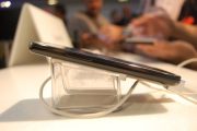
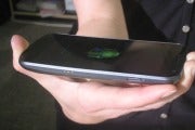
the photos, the Galaxy Nexus has a subtle curve, which nicely contours
to the hand. If you have small hands like me, however, you might find
the Galaxy Nexus a bit large (it measures 5.33 by 2.67 by 0.37 inches). The
Galaxy Nexus is one fine-lookin’ piece of hardware. The glossy display,
piano-black bezel, and textured back are all standard Samsung design
elements. But unlike other Samsung Galaxy phones I’ve reviewed, the
Galaxy Nexus feels high quality. At 5.1 ounces, it has a nice
substantial weight to it without being too heavy. As you can see from
the photos, the Galaxy Nexus has a subtle curve, which nicely contours
to the hand. If you have small hands like me, however, you might find
the Galaxy Nexus a bit large (it measures 5.33 by 2.67 by 0.37 inches).
The Galaxy Nexus has no physical hardware keys on its face.
Instead, the touch-sensitive Back, Home, and Search keys are built into
the display as soft keys.
Super AMOLED Display (No Plus)
The Galaxy Nexus has a high-def Super AMOLED display--not to be confused with the Super AMOLED Plus technology
found in the Samsung Galaxy S II line of phones. This 1280-by-720-pixel
display is actually based on a PenTile pixel structure in which pixels
share subpixels.
points out that the Galaxy S II phones have full RGB displays in which
the pixels have their own subpixels. This means that the Galaxy Nexus
has lower overall subpixel density, reduced sharpness, and degraded
color accuracy than the Galaxy S II. But according to site flat panel hd the Galaxy Nexus has 315 pixels per inch, which is slightly lower than the iPhone 4/4S at 326 ppi.
To be quite honest, the only quality difference I saw between the
Galaxy S II, the Galaxy Nexus, and the iPhone 4S was in color accuracy.
Colors on the Galaxy Nexus had a slight yellowish tint, mainly in
pictures or websites with a white background. Otherwise, blacks looked
deep, while fonts and details appeared sharp. Unless you’re crazy about
pixel density or have insanely sharp eyes, you probably won’t notice the
slight display downgrade.
The display is a roomy 4.65 inches, but really only 4 inches of
that real estate is usable. The remaining 0.65-inch space is occupied by
a customizable shortcut bar that appears at the bottom of the home
screens as well as some other internal screens. Even so, the screen
feels plenty spacious for all of your gaming, video, and other
multimedia desires.
Ice Cream Sandwich: Simply Sweet
We’ve written extensively on Ice Cream Sandwich, and will be
doing much more in-depth coverage in the next few days. For this review,
I’ll focus on how Ice Cream Sandwich performs on the Galaxy Nexus.
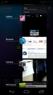
  The Recent Apps screen. If
you’re familiar with Android Honeycomb on tablets, you’ll find a few
familiar features in Ice Cream Sandwich. As in Honeycomb, widgets in Ice
Cream Sandwich are now resizable on the home screen. You'll also find a
dedicated on-screen Recent Apps button for seeing all of your open
apps; just as on Android tablets, it displays a scrollable list of
running apps with thumbnail images. Flicking through and switching
between apps is not as speedy as I would like it to be, however--I
encountered a noticeable delay when going from one app to another. The Recent Apps screen. If
you’re familiar with Android Honeycomb on tablets, you’ll find a few
familiar features in Ice Cream Sandwich. As in Honeycomb, widgets in Ice
Cream Sandwich are now resizable on the home screen. You'll also find a
dedicated on-screen Recent Apps button for seeing all of your open
apps; just as on Android tablets, it displays a scrollable list of
running apps with thumbnail images. Flicking through and switching
between apps is not as speedy as I would like it to be, however--I
encountered a noticeable delay when going from one app to another.
You’ve probably heard a lot of buzz about the ability to unlock
your phone with your face. The front-facing camera snaps a picture of
you and then uses facial recognition software the next time you unlock
your phone. It's cool, most definitely, but it's not the most secure way
of protecting your phone. As Google warns, somebody who looks similar
to you can unlock your phone with their face. Nevertheless, face unlock
works well, and it is a pretty neat--although somewhat
gimmicky--feature.
The Android software keyboard in Ice Cream Sandwich has larger,
more square keys so it is easier to type on (though I still made a few
errors here and there). You now have an option to verbally dictate your
text, as well, though I didn’t always find it accurate. For example,
"This is a test of the auto-dictate feature” translated into "Types of
the otter dictate feature.”
Developers will delight in the dedicated "Developer options,”
which let you access tools such as a CPU usage meter and controls for
touchscreen feedback and the background process limit. It is features
like this that truly make Android a standout operating system. There’s
something for everyone.
The Core Apps
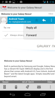
  The new Gmail with the Action Bar. Gmail
gets a face-lift, with a new context-sensitive Action Bar at the bottom
of the screen. The bar changes depending on where in the app you are.
For example, when you’re looking at an email message, you see options to
archive it, trash it, label it, or mark it as unread. When you’re
viewing your inbox, the bar changes to display options for composing new
messages. Adding attachments from your gallery or other folders is now
much easier as well. If you’re a heavy Gmail user like me, you’ll really
appreciate these updates. The new Gmail with the Action Bar. Gmail
gets a face-lift, with a new context-sensitive Action Bar at the bottom
of the screen. The bar changes depending on where in the app you are.
For example, when you’re looking at an email message, you see options to
archive it, trash it, label it, or mark it as unread. When you’re
viewing your inbox, the bar changes to display options for composing new
messages. Adding attachments from your gallery or other folders is now
much easier as well. If you’re a heavy Gmail user like me, you’ll really
appreciate these updates.
The browser in Ice Cream Sandwich is just about as close as you
can get to a desktop one. You can now set the browser to request full
desktop versions of sites, not the lesser mobile versions. You can also
sync your bookmarks from the desktop Chrome browser to the Browser app
in Ice Cream Sandwich. Google has added support for tabbed browsing, and
you can quickly view which tabs are open, each with a live preview of
that page.
Google Calendar pretty much runs my life, so I was pleased to see
a cleaner, easier-to-read version of it in Ice Cream Sandwich. I also
appreciate the fact that you can pinch-to-zoom in on a particular
calendar event to see more information about it; previously you had to
tap on the calendar event, and it would open a new window. Like all of
the other core-apps updates, Google has made everything in the Calendar
more efficient and easier to use.
Unfortunately, Google Wallet is not supported on the Galaxy Nexus--despite the fact that the phone’s hardware support
...
Read more »
|
there are several lists with "ways to make money with a website” on the
Internet, but none of them seem to be complete. That is why I decided
to create this one. If you know a method that is not listed below, just
let us know and we’ll update it.
Notice that ways to make money with a website are different from ways to make more
money from it. Methods to increase your traffic or click-through rate
will help you make more money, but they do not represent a method of
making money per se.
For example, one could suggest that blending AdSense ads with the
content is a way to make money from a website. In reality it’s not; it’s
just a way to make more money by improving your ad click-through rate.
The real monetization method behind it is a PPC ad network.
The list is divided into direct and indirect methods, and examples and links are provided for each point. Enjoy!
Direct Methods1. PPC Advertising Networks
Google AdSense is the most popular option under this category, but
there are also others. Basically you need to sign up with the network
and paste some code snippets on your website. The network will then
serve contextual ads (either text or images) relevant to your website,
and you will earn a certain amount of money for every click.
The profitability of PPC advertising depends on the general traffic
levels of the website and, most importantly, on the click-through rate
(CTR) and cost per click (CPC). The CTR depends on the design of the
website. Ads placed abode the fold or blended with content, for
instance, tend to get higher CTRs. The CPC, on the other hand, depends
on the nice of the website. Mortgages, financial products and college
education are examples of profitable niches (clicks worth a couple of
dollars are not rare), while tech-related topics tend to receive a
smaller CPC (sometimes as low as a couple of cents per click).
The source of the traffic can also affect the overall CTR rate. Organic
traffic (the one that comes from search engines) tends to perform well
because these visitors were already looking for something, and they
tend to click on ads more often. Social media traffic, on the other
hand, presents terribly low CTRs because these visitors are tech-savvy
and they just ignore ads.
List of popular CPC advertising networks:
2. CPM Advertising Networks
CPM advertising networks behave pretty much as PPC networks, except
that you get paid according to the number of impressions (i.e., page
views) that the ads displayed on your site will generate. CPM stands for
Cost per Mille, and it refers to the cost for 1,000 impressions.
A blog that generates 100,000 page views monthly displaying an
advertising banner with a $1 CPM, therefore, will earn $100 monthly.
CPM rates vary with the network, the position of the ad and the format.
The better the network, the higher the CPM rate (because they have
access to more advertisers). The closer you put the ad to the top of
the page, the higher the CPM. The bigger the format (in terms of
pixels), the higher the CPM.
You can get as low as $0,10 and as high as $10 per 1,000 impressions
(more in some special cases). CPM advertising tends to work well on
websites with a high page views per visitor ratio (e.g., online forums,
magazines and so on).
List of popular CPM advertising networks:
3. Direct Banner Advertising
Selling your own advertising space is one of the most lucrative
monetization methods. First and foremost because it enables you to cut
out the middleman commissions and to determine your own rates. The most
popular banner formats on the web are the 728×90 leaderboard, the
120×600 skyscraper, the 300×250 rectangle and the 125×125 button.
The downside of direct banner advertising is that you need to have a
big audience to get qualified advertisers, and you will need to spend
time managing the sales process, the banners and the payments.
Related links:
4. Text Link Ads
After Google declared that sites selling text links without the
nofollow tag would be penalized, this monetization method became less
popular.
Many website owners are still using text links to monetize their sites, though, some using the nofollow tag and some not.
The advantage of this method is that it is not intrusive. One can sell
text links directly through his website or use specialized networks
like Text-Link-Ads and Text-Link-Brokers to automate the process.
Text link marketplaces and networks:
5. Affiliate Marketing
Affiliate marketing is a very popular practice on the Internet. Under
this system you have a merchant that is willing to let other people
(the affiliates) sell directly or indirectly its products and services,
in exchange for a commission. Sometimes this type of advertising is
also called CPA (cost per action) or CPL (cost per lead) based.
Affiliates can send potential customers to the merchant using several tools, from banners to text links and product reviews.
In order to find suitable affiliate programs you can turn to individual companies and publishers like Dreamhost and SEOBook, or join affiliate marketplaces and networks.
List of popular affiliate marketplaces and networks:
6. Monetization Widgets
The latest trend on the web are widgets that let you monetize your
website. Examples include Widgetbucks and SmartLinks. Some of these
services operate under a PPC scheme, others behave like text link ads,
others yet leverage affiliate links.
Their main differentiator, however, is the fact that they work as web
widgets, making it easier for the user to plug and play the service on
its website.
List of companies that provide monetization widgets:
7. Sponsored Reviews
PayPerPost pioneered this model, with much controversy on the beginning
(related to the fact that they did not require disclosure on paid
posts). Soon other companies followed, most notably Sponsored Reviews
and ReviewMe, refining the process and expanding the paid blogging
model.
Joining one of these sponsored reviews marketplaces will give you the
opportunity to write sponsored posts on a wide range of topics. Not all
bloggers are willing to get paid to write about a specific product or
website (because it might compromise the editorial credibility), but the
ones who do are making good money out of it.
If your blog has a big audience you could also offer sponsored reviews directly, cutting off the commissions of the middleman.
List of sponsored reviews and paid blogging networks:
8. RSS Feed Ads
With the quick adoption of the RSS technology by millions of Internet
...
Read more »
|
Speed Up My PC is yet another registry cleaner on
the market that promises to improve the running speed of your computer
offered by Uniblue. It is ranked #5 of the top 5 registry cleaners out
there for this year. Highlights: - Easy, one click instructions
- Manage start up programs
- Easy to read list of problems found
- Low Cost
- Perfect for those who are not tech savvy
Special Features: Speed
Up My PC is getting more and more attention as far as registry cleaners
go, with advertisements found throughout the web and on television. One
of the best features that Speed Up My PC offers is the ease of use that
it gives consumers. It is simple to install and includes simple
instructions that anyone can understand. Among
the many aspects that Speed Up My PC offers is the option to manage
start up programs that can help increase the speed of the PC initially.
This is a problem that most people have, and Speed Up My PC addresses
this concern.
Uniblue’s SpeedUpMyPC: the Best Solution to a Sluggish PCHaving
a fast computer system is such a big deal, especially for those who use
computers for their job. Even those who are using it for personal
purposes, a slow computer is very frustrating. Computer systems tend to
slow down whenever a user adds or downloads more applications to the
computer, there are many rouge downloads available today in the
web-based environment that contains viruses and trojans that the
downloader doesn’t even know. Even just by updating the operating system
which can tax the system’s memory heavily can slow down the computer’s
processing power. All
of the abovementioned problems usually occur without even the knowledge
of the computer user, especially those who are not computer savvy.
However, the computer can be upgraded but this is very costly and doing
system upgrades every time the computer slows down is such a pain in the
neck. The best way to solve the problem is by having a PC cleaner or a
registry cleaner to optimize the computer system; and SpeedUpMyPC
addresses the problem well.  SpeedUpMyPC
is yet another kind of a registry cleaner created by Uniblue, an award
winning international company that specifically creates software and
applications that improves computer system’s speed and stability. From
the software’s name itself, the specific job of SpeedUpMyPC is to make
your computer system work faster. This software aims to yield a powerful
tool to optimize and improve the computer system by identifying the
processes, files and settings of the computer that causes the slow down.
SpeedUpMyPC, just like other registry cleaners, includes the following
functions: - Performs
system scan in the computer and identifies system errors, junk files
other problems that causes computer slow down or crashes.
- Optimizes computer system by eradicating unused and infected files or restoring system errors.
- Executes
thorough scanning regularly of the computer system to prevent crashes
and freezing so that the computer can do a better performance.
Among
these functions mentioned above, SpeedUpMyPC also includes special
features that can optimize well the system of the computer, as well as
the internet connection. The software is more likely used by those who
uses or surfs the internet frequently. Aside from scanning and checking
for errors, the software SpeedUpMyPC guarantees consumers with its
special features: CPU Management–
Manages the CPU to prevent unnecessary processes and usage of memory
and enhance the use of the system and have optimum performance. It
provides the user two options, there’s the Free Up RAM option that
allows user to release unused memory; and the other option is the Deep
RAM Recovery that scans deeper for memory that can be freed up. Hard Disk Drive Management–
This feature tends to manage the hard disk drive of the computer and
prevent or remove any unnecessary files, temps and junks file that
causes slow performance of the computer system. Internet Speedup–
SpeedUpMyPC includes a web button that allows the user to optimize the
current bandwidth utilization, regardless of the type of internet
connection used. It optimizes the internet or connection settings using
the same principles of speeding up other programs. The software c
...
Read more »
|
Samsung has released the new edition of Galaxy Tab , the tab 7.1 , 8.9
and the Galaxy tab 10.1 is the latest tab . The Galaxy tab 10.1 is more
than lighter and Thinner than Apple iPad 2 . I Compared the Some
specification of Galaxy tab 10.1 vs iPad 2
Features : Apple iPad 2 Samsung Galaxy Result
Processor 1 Ghz Dual Core 1 Ghz Dual Core Both Equal
weight
601g
595g Galaxy is lightner
Cost 16GB WIFI 499$ 499$ Both Equal
Thickness
8.8m
8.6m Galaxy is thin
Display
1024 x 768 px
1280 x 800 px Galaxy is better
Camera
0.92 MPx Rear & Decent VGA 3
Mpx Rear & 2 Mpx
Front Cam (Shoot 720p video ) Front Cam
(Shoot 1080p) Galaxy Beat iPad
Pictures :
|
DOWNLOAD FREE QUICK HEAL TOTAL SECURITY 2010 FULL VERSION
Quick Heal AntiVirus 2010, with its intuitive and easy-to-use interface,
provides hassle-free protection for your system. Once installed it acts
as a shield against viruses, worms, trojans, spywares and other
malicious threats. It also provides protection against new and unknown
viruses using Quick Heal's renowned DNAScan technology, and blocks malicious websites. Quick Heal AntiVirus 2010 is very low on resource usage and gives enhanced protection without slowing down your computer.
Download:
SETUP + CRACK
Code:
http://www.fileserve.com/file/WehmUAY
| |
 Like
most of the latest and greatest smartphones, the Droid Bionic has an
8-megapixel camera. It can shoot up to 1080p HD video, too; it's the
first Verizon LTE phone to be able to do so. When I met with Motorola, I
asked the product managers why the Droid Bionic took so long to come to
market. Their response? Among other features, 1080p was added to the
phone after Motorola's initial CES announcement.
 We've
never been blown away by the image quality on Motorola cameras--the
white balance tends to be off, giving photos and video a bluish tint.
The Photon’s camera was slightly better than those of other Motorola
phones, such as the Droid 3 and the Triumph,
so I had rather high expectations for the Bionic’s camera. Thankfully,
it met my expectations: Although the Droid Bionic’s camera isn’t the
best I’ve seen (that honor goes to the T-Mobile MyTouch 4G Slide), I was
pleased with the sharpness, color accuracy, and brightness of my indoor
and outdoor photos.


